PRESS RELEASE - 'BEING HUMAN' (WELLCOME COLLECTION)
Wellcome Collection - Being Human
https://wellcome.ac.uk/press-release/being-human
https://wellcomecollection.org/exhibitions/XNFfsxAAANwqbNWD
“Being Human explores our thoughts and feelings about health, our identities, relationships, and our impact on the changing environment. Our understanding of what it means to be human is being transformed not only by new research but also by the voices of those with diverse identities and experience. Bringing together these objects reveals how we are all different, we are all valuable and we are all connected.” - Clare Barlow (Quote taken from website)
As a human - 'what, whom and how do we occupy the planet?', 'what are some of the the main challenges all of Earth's inhabitants face now and in the future?', 'how to we as homo sapiens communicate and express our opinions to the open-world?' These were some questions that came to my mind when I read the project brief.
I had planned to go to the 'Being Human' exhibition in Wellcome Collection before the start of our first lecture in the Fine Art pathway. In order to fully understand the concepts behind each of the works being displayed in the exhibition, I read a press release published by the Wellcome Collection site. The article explained the purpose and aims of the works - to explore what it means to be human in the 21st century. This incorporates the themes of trust, identity and health. The exhibition is divided into four sections: Genetics, Minds & Bodies, Infection, and Environmental Breakdown. I was immediately interested in what kind of works would be displayed in the exhibition as I was very interested in the idea of utilising 'genetics', 'minds & bodies', and 'infection' to present the beliefs and values of being human. I really liked the idea of incorporating science and data into artwork - I think this adds both an element of conceptual and aesthetic qualities to an art piece. It also makes me think about the boundaries of what 'art' itself could be when other interdisciplinary subjects are added into the artwork. I believe that these elements are very important in the contribution of being human as it reflects the responses that our bodies make in regards of the concerns and issues that are raised by society. I was ready to challenge our hopes and fears/impacts about new forms of medical knowledge developed in the world. I also wanted to allow audiences to think deeply about the connections between science, medicine, life and art - as well as the irony of human behaviours in our society. I think it is important to consider both the 'impacts' and 'relationships' of social norms, behaviours and cultural diversities in society, thus acknowledge its affects to our changing environment.
The press release described each section in detail and the types of works that would be expected to be displayed in the exhibition. As I was reading the article, it gave me the opportunity to brainstorm different questions in response to the description. The notes below were a summary of my thoughts and opinions while reading the article:
GENETICS
- How does genetics relate to the human body?
- How much do we really know about our genetic inheritance?
- What makes up our body? How do we figure out what gene controls a trait?
- How do these traits define us? How do they work simultaneously with our body?
- Can our genetic inheritance predict the future?
- 70% of our genes are shared with zebrafish
- often used in medical research
- 'Stranger Visions' - Heather Dewey Hagborg, collected hair, chewed up gum and cigarette butts from the streets, public bathrooms and waiting rooms in NYC --> Extracted its DNA, looked for traits associated with appearance to computationally generate 3D printed imaginary portraits.
- Tamsin van Essen - explores genetics and inheritance through her work Medical Heirlooms (a collection of ceramic jars, affected by various hereditary diseases) - explore hereditary health conditions including psoriasis and osteoporosis
- Explores various methods of changing and improving medical history
MINDS & BODIES
- How does our social, cognitive and biological behaviour affect our body/presence?
- How does our mental health affect our behaviours and the way we interact with other people?
- How does our body represent/present ourselves? Does this change how we value ourselves?
- How does our mind affect the way we view the society? Does this change the way our society is developed?
- Dolly Sen's - "Help the Normals and Dignity" --> challenges the preconceptions of mental health conditions and their treatment. (Ideas that have been formed without valid evidence to back up)
- Deborah Kelly - 20 life-size portraits - "No Human Being is Illegal" - Volunteers were photographed naked, asked what they wanted people to know about them
INFECTION
- What is an infection?
- Can infection be interpreted as our thoughts and feelings?
- Can infection tell us about our past?
- Can infection show our fears?
- Explores our thoughts and feelings about infection
- Shows how this affects our relationships with others
- 'Eleven' - Kia LaBeija - focuses on her identity as a black woman living with HIV
- Personal and sensitive to the artist
- taken after her mother died
ENVIRONMENTAL BREAKDOWN
- How do we figure out our surroundings? Does ours surroundings define who we are?
- How does being 'lost' affect our behaviour? How do we respond to this?
- What does it mean by 'environmental breakdown'?
- Where do we find ourselves in future?
- Is it possible to locate /predict what we are doing in the future?
- How does the social and political issues affect our well-being/ humanity?
- Superflex - short film 'Flooded McDonald's' - reflects on consumption, capitalism and the effects of climate breakdown
- Yinka Shonibare - Refugee Astronaut - A life-size astronaut wearing a suit made from fabric, reflecting traditional Nigerian textiles - Creates their own stories about who the figure might be, where they come from, why they have to leave Earth in such a hurry
Guardian Review - 'Being Human' Exhibition Visit
Yinka Shonibare’s Refugee Astronaut, Wellcome Collection - 'Being Human'. (Taken from 'The Guardian' article)
https://www.theguardian.com/science/2019/sep/01/being-human-wellcome-collection-exhibition
As mentioned from the brief, I also read a review written by the Guardian on the Wellcome Collection exhibition. The information mentioned in the article was very much similar to the ones mentioned in the press release. However, there were more detailed descriptions on the works that deal with environmental breakdown. It further explains how these artworks attempt to engage with the audience by allowing them to contemplate and reflect on the global impact of environmental breakdown. Specific details such as the composition, materials and layouts used in an artwork was explained to convey the theme of environmental issues in society. For example, the article specifically selected the work 'Refugee Astronaut' by British-Nigerian artist Yinka Shonibare - the work depicts a traveller, wearing a spacesuit made out of "Dutch wax fabric and moon boots". This made me question why the artist specifically chose fabric as his main medium for this piece. Perhaps it was to convey the visual imagery of what refugees look like as they were being forced to cross national boundaries. The writer further described the gesture of the astronaut and its position when being displayed in the exhibition space - 'carries a net of possessions on his back". What interested me the most was the title of the books that were in the astronaut's backpack - "The Last Migration" and "The Quest for the Perfect Place". The word 'last' reminded me of the urgency and desperation from refugees who walked for long distances only with hopes to find a lasting home. The phrase "perfect phrase" almost sound surreal and ironic at the same time as it almost seemed impossible to find a home whether they can finally rest. From my perspective, I wasn't as interested in exploring the theme of environmental issues for this project since it wasn't my strongest part of knowledge or interest. In fact, I was more interested in exploring the scientific relationship between human qualities and scientific research in current history - how art can be presented in a more scientifically way.
'Refugee Astronaut' - Yinka Shonibare, (Wellcome Collection) (Image taken from me)
Yinka Shonibare predominantly explores cultural identity, colonialism and post-colonialism in his works. The 'Refugee Astronaut' is one of the main installations displayed in the 'Being Human' exhibition. It was the first piece that caught my attention when I visited the exhibition due to its large scale and size, as well as the brightly coloured Dutch wax fabric that he used. As I was observing the position and gesture of the astronaut, I realised that the artist had purposefully made it 'seem' like the 'traveller' is in the middle of walking. This can be seen from the spherical helmet, spacesuit and moon boots which reflected the possible chances of the traveler's intergalactic journey. What struck me the most was the backpack that was carried by the astronaut. It almost seemed like he was over-prepared for his trip. Bits of the travellers possessions were sticking out from the luggages which may suggest another story. It could be that the traveller is taking a trip/journey away from his personal problems and issues, but it could also portray the theme of escape, desperation and urgency.
Screenshot of article (The Guardian) - Wellcome Collection
Being Human / 21 Lessons for the 21st Century
YUVAL NOAH HARARI
Extract taken from 'A Brief History of Humankind'
In my own time, I read the books written by Yuval Noah Harari. The book was very interesting to read, in fact I had to say that I agree to most of the things that the writer has mentioned in the book. It was interesting to see another perspective of how we behave in regards to genetic evolution. From the book, it states that our behaviours can be determined by our genes, same with animals. This to me was a very important statement since it made me wonder what else humans can do without themselves knowing... Behaviours and attitudes can be expressed naturally, therefore it is inevitable that some do not realise it. This might be the case physically, but what if it's our genetic makeup which causes changes in our body and mind?
VIK MUNIZ & TAL DANINO - COLONIES
VIK MUNIZ & TAL DANINO - COLONIES
Vik Muniz and Tal Danino - 'Colonies' (Detail)
http://www.taldaninoart.com/colonies
When I was first interested in working with real bacteria, I came across Vik Muniz and Tal Danio's works titled 'Colonies'. Their works predominantly focuses on making art out of bacteria and cancer cells. At first, the works only looked like normal patterns, many of them were very traditional looking, almost like the patterns that we see from church or the ones from carpets. However, when I had a close look into what the patterns made out of, I was shocked to see that they were made out of live bacteria. They were even moving! It's very rare to see artists who uses unusual materials to create art, therefore I really admire the artist's use of experimentation in his works to create beautiful pieces of art. The ability to blend science, technology and art together no only investigate interdisciplinary practises of wider knowledge, it also gives us an intersection of current research directions and personal experiences as a scientist.
SAINT ORLAN - FACE REINCARNATION - METAMORPHOSIS
SAINT ORLAN - 'METAMORPHOSIS', FACE REINCARNATION
Saint Orlan - 'Metamorphosis', Face Reincarnation
Out of all the artist research that I have done recently for the being human project. Saint Orland is probably one of the most strange and shocking artists I have came across with. I didn't mean it in a way that I disliked her works. But it was the fact that her works are quite disturbing and gross at the same time. It is VERY hard to watch and all I could do was listen to her voice during her interviews. As shown in the video above, the artist uses her own body, especially her face as a canvas. She does this by applying cosmetic surgery to transform her face to different forms. One of the most shocking controversial and highly provocative works that Orlan has done was "undergoing facial surgery in order to make specific characteristic features from the world of art history appear more alive." This work was titled 'Reincarnation of Saint Orlan - she was inspired famous people such as Venus, Diana, Europa and Mona Lisa. I think it is very brave of Orlan to use her own face and undergo surgery in order to turn into a completely different person. Knowing that this is a permanent change, there would be potential ethical issues while undergoing these surgeries. However, despite the permanent change, the artist uses this as her advantage to transform her own physical body to portray classical beauty ideas from Western art.
DAVID LIGHT THERAPY - PREMATURE BABY
David Bishop - Premature Baby - Light Therapy
I was curious about the idea of combining science into art, knowing that Fine Art is very broad which allowed us to explore interdisciplinary practises. I took this as an opportunity to research more about the scientific as well as futuristic essence of art. I was interested in how artists can combine scientific knowledge and represent them as an art form. I came across David Bishop's 'Premature Baby' which portrayed a newborn baby receiving light therapy in a Hospital. Even though this was definitely leaning more to the 'science' side than art, I can't help but admire the photograph. It was so beautiful to see a baby being shone under the light in an incubator. David Bishop's work was awarded as one of the winners from the Wellcome Collection and I can definitely see why. The photo made me realise to fragile a newborn human being was. I really love the blue colours in the photograph. The colour blue often connotes calm and relaxation, as portrayed from the baby as well. It seems as if I can almost sense the quietness around the room. I chose this as part of my research as it further reinforced the fragility of human beings and the importance of medical facilities in today's society.
'RE-EDIT' - ARTHUR JAFA - LOVE IS THE MESSAGE, THE MESSAGE IS DEATH
'RE-EDIT' - ARTHUR JAFA
In this video, Arthur Jafa specifically uses found footages that explore traces of African-American identities, thus emphasising the power, beauty and alienation of Black Music. The video also gives a reminder to audiences that the African -American culture is comprised of singular individuals, which holds unaccountable differences. This wasn't my favourite video piece out of all the other videos that I have selected as part of my research for my re-edit project. However, I chose this because I liked the use of found footages, specifically ones which holds more historical meaning. As such the filter of the videos seem very old, some were in low quality whereas other were in high. I really liked the combination of low and high quality found footages in the video. Overall the video has created a swelling, emotional montage that allowed viewers to understand the culture and traditions of black people. Even familiar black icons and historic events are included in the video which can be seen as a form of memorial.
'RE-EDIT' - CLAPPING MUSIC
'RE-EDIT' - CLAPPING MUSIC
When I first watched this video, I can't help but find this video humorous and silly. The longer the video was played, the more I can sense a rhythm and pattern being heard. This was made in a very clever way in which the beat can be very hypnotising to the audience. Even though the scene was just constantly being repeated, the repetition of a singular sound and action can be very effective to the audience. It even changes the mood and atmosphere that was initially intended. I found it very clever how the footage was edited in a way that the original context of the footage is missing, this allows the audience to interpret a completely new meaning for the video which I find very amusing.
'DATAFIED' - THE GUARDIAN - BIG DATA RESEARCH
The Guardian - 'Are you ready? Here is all the data Facebook and Google have on you' - Dylan Curran
https://www.forbes.com/sites/lisaarthur/2013/08/15/what-is-big-data/#7790029e5c85
Before going deeper into research artist in relation to big data, I decided to look at some articles online that explain the idea about what big data is and where large internet companies such as Google and Facebook are so common with the subject of storage of information. While I was reading the article, I can't help but have mixed feelings about the fact that I knew Google and Facebook knew so much about me as. As mentioned in the article, today data science knows everything we've searched and deleted. It also determines the ads we see online, as well as the books and movies that are recommended to us online. In a way, I thought this felt very creepy, I don't think there is another way of explaining this feeling. It just feels as if I am being watched everyday. It also feels disturbing that I don't know what the servers know about me. The thought of this scares me in so many ways.
'DATAFIED' - FORENSIC SCIENCE - FINGERPRINTS
Forensic Science - Fingerprinting
I imagined the situation where my fingerprint was taken without my consent and used for research - I think I would feel both confused and anxious as to what the researchers would use the information for. It is inevitable that by obtaining the fingerprint of an individual, the identity can be easily revealed; which could lead to other serious troubles/circumstances such as exposing the individual's personal details or track the individual. This made me realise how advanced today's science and technology has become.
Forensic Science Online - Fingerprint Identification (https://www.forensicscienceonline.org/)
'DATAFIED' - COOKIE SCRAPING
https://abc13.com/technology/3-ways-data-thieves-are-stealing-your-info-online/4600107/
During our discussion in class, we talked a lot about HTTP cookies and 'accepting terms and conditions'. An HTTP cookie is a small piece of data in the form of a file which is installed into your device (e.g computer) which records information about the sites that you have accessed. However, the type of cookie that I predominantly want to focus in is the 'persistent cookie' - which as mentioned above: "allow websites to remember settings like login or account information." The article follows by stating that if a virus window suddenly pops up for no reason while the individual is accessing the website, there is a possibility that a hacker may have hacked into the user's device and installed the 'forged cookie' which allows the hacker to steal the users information and personal details. By depicting this into my work, I want to create something like a game in the form of a video which shows how easily an individual can be tricked by downloading or accessing websites online.
'DATAFIED' - LAURI NUMMENMAA - MAPPING EMOTIONS
Lauri Nummenmaa, Riitta Hari, Jari K. Hietanen, and Enrico Glerean / Nummenmaa Lab
https://curiosity.com/topics/scientists-have-mapped-where-people-feel-emotions-in-their-bodies-curiosity/
This chart was generated by surveying different people from different nationalities and ethnicities. They were all asked the same questions as to where they think a particular emotion is felt. The results turned out to show that even though they were all different people, they had similar thoughts in regards to where they think the particular emotions can be felt in their bodies. I really liked how this chart uses the brightness of the colours red and yellow to portray the strength of emotion that can be felt in different parts of the body. It seems both scientific and realistic at the same time. It surprised me that even thought this was just a 'current' idea that I had thought of during my critique session, I was able to receive such interesting information from my peers which I feel very grateful for. Of course, my tutor also told me that since 'emotions; is very broad, therefore I should pick a particular emotion that I am interested in. I was particularly interested in the emotions of both anger and pain at that time.
'DATAFIED' - MARK HANSEN & BEN RUBIN
Mark Hansen & Ben Rubin, Listening Post, 2001-2
Listening Post is an installation piece created by Mark Hansen and Ben Rubin which explored the flow of data. I was instantly attracted to the beautiful neon blue colours that glow in the dark room. It made the installation itself look more scientific and futuristic. I really liked how the texts are displayed in the small boxes which reminds me of the constant notifications that we get once we look at our smartphone devices. The installation seems endless and this really portrayed how much data can be carried or even collected.
'DATAFIED' - ED ATKINS - OLD FOOD
Ed Atkins, "Old Food" (production still), 2017. Image courtesy of Martin-Gropius-Bau.
https://momus.ca/crocodile-tears-ed-atkins-crisis-pathetic-masculinity/
In the beginning of this project, I was interested in the idea about emotion of pain, my tutor suggested this artist which worked with artificial intelligence and making people cry. The artist created three-dimensional avatars and made them cry which depicts the ability of humans to empathise. Visually, I thought the avatar was created in a hyper-realistic way, especially the way the face was crying as the tears were rolling down its face, it almost felt surreal and a little creepy by just staring at a big face. At first, I thought it felt a little disgusting since you can literally see the snot that was forming and dripping down the man's face, but this was what makes the avatar look so realistic, almost to the fact that it seemed like an actual being. Even though this doesn't really relate to big data as much, but I thought its quite interesting on how the artist incorporated the idea of emotions and technology into his works.
'DATAFIED' - MOLLY SODA - CRINGE WARNING
Molly Soda - 'Cringe Warning', 2017
https://www.youtube.com/watch?time_continue=13&v=9F2tk7rxkSA
Molly Soda is a web-cam performance artist who presents herself behind the internet sharing her web-based performances across different social media platforms. Through her works, she tries to express her vulnerability online via private spaces in her bedroom. Other common themes that were portrayed in her works include the technological mediation of self-identity, contemporary feminism, culture and perversion. What I like about Molly's works is the way she uses old internet to create her own 'world'. It seems like the artist likes to use old internet to portray what is happening in her life. Similar to Cameron Askin's works, both of the artists aims to utilise old internet platforms to portray the idea of digital media and technology.
Molly Soda - 'Cringe Warning', 2017 - Installation
Many of her works tend to explore computer art that was more prevalent in the early 2000s. As mentioned in her interview, she stated that the aesthetics in internet is a very important part of her works. Moreover, I love the way she uses a lot of colours graphics which connotes the idea of youth in humans. Molly's work reminds me of the artist 'Ana Voog' who was also an web-cam artist who explore the themes of her identity. Both artists try to explore their own characters through internet by self-recording videos and graphics. I think this is an interesting way of questioning what can art be in our society.
Screenshots from Molly Soda's website
'LUX' - DUNCAN POULTON - JETSAM
Duncan Poulton - Jetsam, 2016 (Still Images)
https://aos.arebyte.com/contents/duncan-poulton-jetsam/
"An assemblage of footage scoured from the depths of the internet, Jetsam is a densely layered video-collage which combines computer-generated simulations of water into a constantly swirling and overlapping pool of unreal images. The soundtrack comprises simulated liquid sounds which composer Richard Stenton has reconfigured into new syncopated and congealing sonic forms."
Even though this doesn't exactly relate to the idea of green spaces, I love how this piece conveyed the beauty of ocean and water. The combination of sound effects from nature and water droplet effects sounded very mesmerising. At some point, the sound effects even sounded very alien-like. I was even more surprised by the movement of the water when its flows onto the screen, it seems as if the water has come out of the screen. I also really like the idea of combining computer-generated simulations of water with real water images. This made it look even more surreal. I may not be focusing on water as my main subject for this video, however I was immersed in the sound effects and slow movement of the water. I am thinking of including more dreamy sound effects in my video for experimentation.
Duncan Poulton - Jetsam, 2016
'LUX' - MAX COLSON - THE GREEN AND PLEASANT LAND
Max Colson - The Green and Pleasant Land (Still Image)
https://maxcolson.com/portfolio/thegreenandpleasantland/
https://aos.arebyte.com/contents/max-colson-the-green-and-pleasant-land-2/
We were shown this video piece during class and I remembered not being able to focus my attention on the video because of the music and sound affects that was playing on the background. Surely, I loved the music since it brought a very calm and relaxing atmosphere, which also clearly represented the calmness and beauty of nature. The visual imagery in the video were also very fascinating as it explored the intersection between "architecture, landscape and their interpretation through the lenses of laser scanning and 3D architectural animation." It was interesting to see how we can use technology to interpret the concept of green spaces. However, I just felt that the music and the visual imagery just didn't work well with one another... Maybe it's just me, but I couldn't focus on both things at the same time, normally it would be very easy to focus on both areas. But I seem to not be able to do that for this piece - maybe it was because there was so much going on in the visuals which made me a little confused and lost as to what was happening. If I focused on the music, I couldn't focus on the visual imagery and vice versa. Despite this, I found it fascinating how the artist had utilised different perceptions of the British landscaped and sketched it out in a 3D model software. The concept of the video further suggests potential arguments that can be debated based on people's views concerning the English and British countryside. This wouldn't be one of the references I would solely rely to, but I admire the calming music and sensation that the video has given to us when watching the video.
Max Colson - The Green and Pleasant Land (Still Image)
'LUX' - SEMICONDUCTOR - ALL THE TIME IN THE WORLD
Ruth Jarman & Joe Gerhardt - All the Time in the World, Semiconductor
https://semiconductorfilms.com/art/all-the-time-in-the-world/
'All the Time in the World' not only portrayed the beauty of nature, but it also introduced the natural process of the tectonic movement - this describes the large-scale motion of tectonic plates moving against each other, causing disturbances and disrupt around the natural surroundings. It was interesting to see the artist represent a natural process in nature as a fictional documentary which allowed viewers to see how the plates moved in an artistic perception. Referring to the ASOS website, it states that the video aims to portray the "millions of years that have shaped and formed the land, played out at the speed of sound." With the use of data recordings from archives, the artist was able to convert this into sound audio. Watching the video made me feel lost, but at the same time it made me want to follow the direction of the light that it was heading to. The audio further adds tension and suspense to the video which represented the thumping sounds of the disaster occurring. Even by just watching it through the screen, it felt like an earthquake where I as a member of the audience can feel the sudden movement of land following with the rhythm and music that it had created. Overall, it feels like the idea of 'beauty comes after a disaster'.
'LUX' - JENNY OKUN - FOCUS
Jenny Okun - Focus, 1978
https://lux.org.uk/work/focus-ii
Jenny Okun's Focus' film is very abstract and focuses more on the editing techniques, which of course one of them is obviously focusing on the images of nature such as branches and plants. I found this technique very interesting, it seems like the artist wants us to look further and deeper into the make up of nature. It allows us to observe the details of the plants - ironically this couldn't be done since when the footage is zoomed in, the quality of the footage is lower. I think this trains the viewers brains to figure out the outline of the subjects, in addition giving us a static viewpoint in the Lake District.
'LUX' - JAKOB STEENSEN - TREE VR
'LUX' - JAKOB STEENSEN
Jakob Kudsk Steensen - Tree VR
http://www.jakobsteensen.com/#/tree-vr-rainforest-alliance-and-new-reality-co/
I have been very interested in virtual reality for a while, one of my ideas was to create a video that has similar aspects by having an image on one side, and a blank image on the other side. This idea really plays with the audience's eyes and allows them to feel the idea of absence from both sides. When I came across Tree VR, I was instantly shocked by how realistic the forest looked even though it was created digitally. In addition with the sounds of nature, it really felt as if I was in the forest alone, admiring the beauty of nature.
Jakob Kudsk Steensen - Tree VR
MISBEHAVING BODIES - JO SPENCE - 'CANCER SHOCK'
Jo Spence - 'Cancer Shock'
I visited the Wellcome collection and saw the exhibitions 'Misbehaving Bodies'. Jo Spence and Oreet Ashery challenged the medical gaze and looked beyond a diagnosis to form more complex portraits of their subjects. The main aim of their works was to represent the theme of illness and death and present it as a part of the creative texture of life. Many people may see diseases as a 'negative' connotation, but these artists took this as an advantage to question typical narratives and structures. The artists worked collaboratively to create a series of portraits that portray the voices of those who lived experience of life-limiting and chronic illness. This allows audiences to gain a better understanding of these issues. It makes us questions 'how do we care for ourselves?', 'how do we care for those who are ill?'. Through looking at the works exhibited in Misbehaving Bodies and in Being Human, I noticed a similar theme which explored the fragility of human existence and their ability to survive in terrible conditions. I was especially intrigued by the series 'Cancer Shock'. The way it was displayed on the wall seemed very much like a scientific report that could be seen in a laboratory. This inspired me to create a series of works in relation to the ides of medical reports.
Misbehaving Bodies - Jo Spence & Oreet Ashery, Gallery Visit
HEATHER DEWEY-HAGBORG - ' STRANGER VISIONS'
Heather Dewey - Hagborg's - 'Stranger Visions', 2012
In the Being Human exhibition, I was particularly inspired by Heather Dewey-Hagborg's works on 'Stranger Visions'. Stranger Visions is a series of portraits created from DNA which the artist had collected from discarded items such as hair, cigarets, and chewing gum. One of the DNA portraits was exhibited in the gallery and it intrigued me how real the portrait looked even though it could've been a non-realistic individual. This made me realise simple it was to identify a person by just using their DNA and genetic information. This made me want to further explore the biological genetics in our body as well as what happens when our body is infected by a bacterial disease. Since I took biology and psychology in my previous studies, I feel like it would be an interesting idea to incorporate these two subjects in my artwork. As such, Fine Art is interdisciplinary, I believe that by incorporating a wider area of knowledge into my works would allow audiences to gain a better understanding of themselves and their human bodies. Moreover, I think that the idea of incorporating biology and genetics into artwork is very uncommon. Hence, being able to look at all the different artworks in the Wellcome Collection relating to being human has definitely sparked my interest to trying something 'different'.
ROGAN BROWN - BEING HUMAN EXHIBITION
Rogan Brown - 'Magic Circles' - Hand and Laser Cut Paper Microbes
I saw Rogan Brown's work - 'Magic Circle's in the Wellcome Collection. The Magic Circle series is a collection of both hand and laser-cut specimens, inspired by tree moss, cell structures, bacteria, coral, diatoms and radiolaria. I was so intrigued by its delicate patterns and the thin piece of paper which it was made out of. It was almost impossible to create this one my own, but I love the different layers that branch out from the canvas. There was a combination of both small and big fungi-looking shapes which looked very aesthetically pleasing. The process of Brown's work must have been very time consuming and labour intensive since the pieces looked so fragile, it could easily break if a mistake was done... For my project, I was going for a more scientific piece which I assume will look more realistic, however since this exhibition was the first gallery I've visited for this project, Brown's work was definitely an important 'starting point' for my project to be introduced. Looking at the artist's work made me want to communicate my fascination with the immense complexity and intricacy of natural forms.
"My work is an exploration and re-presentation of natural organic forms both mineral and vegetal. I look for patterns and repeated motifs that run through natural phenomena at different scales, from the microscopic to the macroscopic, from individual cells to large scale geological formations."
"I am inspired in part by the tradition of scientific drawing and model making, and particularly the work of artist-scientists such as Ernst Haeckel. But although my approach involves careful observation and detailed “scientific” preparatory drawings these are always superseded by the work of the imagination; everything has to be refracted through the prism of the imagination, estranged and in some way transformed."
Rogan Brown - 'Outbreak.' 2014. - Exploring the microbiological sublime
http://www.medinart.eu/works/rogan-brown/
ELIN THOMAS - 'PETRI DISHES'
Elin Thomas - 'Petri Dishes'
By studying the biological state of being human, it is crucial to study the smallest details of what it means to be human. I came across Elin Thomas' work and was inspired by her use of materials in her series - 'Petri Dishes'. Elin Thomas studies corals, lichen and mould. She predominantly uses yarn/wool to create textured surfaces that mimic the shapes of bacteria. I was intrigued by the amount of detail and texture that was created, along with the use of earthy colours. From far away, it almost seemed as if was real which shocked me even more I really liked how the artist left the material standing up as if creating a furry texture. I think that this further created the realistic texture of bacteria that we cannot see from 'real bacteria'. I also really like Thomas' choice of colour in her works, she particularly chose natural colours such as black, brown, white and beige. I think that these colours really allow the 'bacteria' to stand out in the petri dishes which made me want to try using yarn and wool to create a similar approach for my bacteria as experimentation. Wouldn't it be interesting to use bacteria as part of my project? It would be even more interesting if I was able to grow my own bacteria.
ALDO TAMBELLINI - CELL SERIES
Aldo Tambellini - Cell Series
Aldo Tambellini's works predominantly focuses on expanded media, which meant bringing together photography, television, and poetry. His works are mostly created by applying black paint onto glass sides or celluloid film. Then they will either be burnt or scratched to create textured surfaces onto the sculpture. The artist even pierce circles and spirals onto the surface which made them look a lot like cells seen from under a microscope. According to the artist, the recurring circles convey a sense of 'rippling cosmic energy'. When I looked at his works, I felt immersed into the darkness of the photographs, it looked very scientific and seemed like it would be found in a surgical room or hospital. Tambellini's works are exhibited in exhibitions by projecting them on the ground, allowing audiences to walk over it. I chose this series of works as part of my research as I really love the patterns that were created from the paint, it looks as if the paint has spread outwards which looked a lot like microbes.
Aldo Tambellini - Cell Series
NINA SELLARS - SCAN
Nina Sellars - Scan (Interactive Performance)
I was very interested in the psychological state of the human body due to my previous studies in Psychology classes. I was also very interested in both the biological and cognitive conditions that are occurring inside the brain which causes them to react to certain situations that way they do. In Nina Sellar's work 'Scan', she focuses on the enactment of knowledge - portrayed from the anatomy as it unfolds as a process. A QR code is created as part of her work which contains an encoded body of information. Once the QR code is scanned by a viewer, the code links to and activates an online animation/gif which shows the MRI (magnetic resonance imaging) scans of the artist's brain. I thought this was a very smart thing to do, not only does it show viewers what the artist's brain looks like and is doing, but it also shows the audiences how the brain works as the information coded is being activated. The main purpose of the MRI scan was to show the artist's brain after the surgical removal of a tumour. I really liked the interactive notion of the work which enacted as a durational performance, with the physical body of the artist forming part of the artwork. All together, it seemed very natural. The idea of incorporating technology with the biological state of humankind is very interesting, this shows the importance of both matters and how human anatomy has its symbiotic history with arts and technology.
SUZANNE ANKER - ASTROCULTURE

Suzanne Anker - Astroculture (Shelf Life) ) 2010, Inkjet print, 24×36″
Suzanne Anker is an artist who investigates the ways in which nature is being altered in the 21st century. She mainly focuses on genetics, climate change, species extinction and toxic degradation. Suzanne also likes working with petri dishes, she mainly creates an individual environment in a petri dish using things that can be found in nature such as flowers. The results of the petri dishes looked very beautiful. One of the artist's works that gained my attention was the 'MRI Butterfly'. The MRI Butterfly is a 50 second video which captures the movement of the butterfly flapping its wings accordingly to the music in the background. I love how the butterfly movement was moving simultaneously with the music pattern. It even amazed me more how quick the pace what, the audio further added a playful effect. This could resemble the idea of nature and its playful environment. The image below is a series of photographs showing the human brain and a butterfly. In every image, the movement of the butterfly is different from the previous one. I can see a sense of transparency from the brain scan. After watching the video multiple times, I start to understand the relationship between the butterfly and the brain, this was all about coordination. I think that the butterfly is moving according to how the 'brain' sends the signals, as if the music is portrayed as the signals, whereas the butterfly shows this movement by performing its action. The reason why I love this video is because it feels so hypnotising and mesmerising.
Suzanne Anker - MRI Butterfly
SUZANNE ANKER - MRI BUTTERFLY
SUSAN ALDWORTH - 'OUT OF THE BLUE'
Susan Aldworth - 'Out of the Blue'
https://susanaldworth.com/
'Out of the Blue' is an installation piece created by Susan Aldworth which included 106 pieces of Victorian Underwear, embroiled with the stories of 100 people who had epilepsy. The 106 pieces of underwear were sown together to form 100 pieces and were suspended on the ceiling with wires, attached to motors and computers. It not only included the stories of people who had experience a biological condition, it was also specifically programmed to match the algorithms of an epileptic brain. I was in full of shock when I realised what the meaning of this piece was - the movement of the underwear was so calming and beautiful, it almost looked like a blue sea of brain activity. The installation itself was very big and dynamic, almost having a religious effect. I can't help but watch in awe with how gorgeous the installation was. This piece felt meaning to me as it holds the history of people who wrote their stories and experiences with the living condition. This piece made me realise how important the human brain was and also made me question how much we know about our own bodies.
SUSAN ALDWORTH - DOCUMENTARY
'RE-EDIT' - DOUGLAS GORDAN - 24 HOUR PSYCHO
'RE-EDIT' - DOUGLAS GORDAN - 24 HOUR PSYCHO
24 hour Psycho was one of the videos that I was most intrigued by due to the scenes being lengthened. This not only altered the context of the original film, but it also removed the immediate tension that would be present if the scenes were played at normal speed. When a viewer is watching the film at its normal speed, he/she can see the terrifying scenes which cause them to shiver and block away from. However, when the scenes are lengthened, the viewers can't help but be forced to watch it since it takes a long time for the action from the film to be initiated. This means that the viewer will only see the visual image from the video but not the action that is being held/initiated. When this happens, an inversion is produced which modifies the viewer's way of seeing and thinking. I really liked this video piece as it plays with the audience's emotions by manipulating the viewer's vision, forcing them to look at the image instead of thinking what happens next.
'RE-EDIT' - CHRISTIAN MARCLAY - CROSSFIRE, 2007
Christian Marclay's 'Crossfire' is the perfect example that shows various techniques of editing which included removing, arranging, erase, and to speed up video clips. In the beginning of the video when the guns start shooting, there was a sudden black screen before it starts shooting. This allowing viewers to prepare themselves for the violence in later clips. For me, it was so surprising and sudden that it made me widen my eyes. It was like a quick flash, I felt as if I didn't even prepare myself properly before the firing of bullets. What made the video even more intriguing was the fact that the guns were editing with the purpose of aiming straight at the viewer. If I was in the middle of the installation room, I would definitely feel the intense atmosphere and violence. I think it would've felt very horrifying. This made me realise the importance of gaining the audience attention as well as playing with reactions.
'DATAFIED' - BLACK MIRROR - SHUT UP & DANCE
'Black Mirror' - Shut Up and Dance (Netflix Film)
I came across an episode titled 'Shut Up and Dance'. This episode explores how a virus infects a teens laptop, leading to unwanted threats given from an unknown individual. I was really happy that I came across this episode because this was EXACTLY what was in my mind when I was thinking about http cookies and the impacts of accepting terms and conditions. While watching this episode, I had so many different thoughts which started to piece up together into a puzzle - I looked at the captions and script in 'Shut Up and Dance', there were phrases like: "I joined this website, I was curious. Just wanted to see what was on there". "But not just pictures, chat messages, all the arrangements, where and when - they've got it all". I thought these phrases in the script were very strong by itself which reflected how dangerous the internet can be. It also shows how blind humans are by their desires. The overall summary for this episode simple talks about how humans are blinded by their greed, desires and lusts which in turn leads to unwanted consequences. The writer specifically portrays this using 'data' technology by spreading the individuals personal information and privacy. I thought this was very important as is clearly portrayed the horrifying consequences of technology. After watching this episode, I also felt very frightened and creeped out by what technology and data can do to our lives. The main teenager in this episode was caught by the camera in his laptop device, which therefore allows the 'unknown' to track every single thing that the teenager does. It made me wonder if there could be someone secretly watching me through my camera as well... The thought of this really creeped me out. But that's exactly why I wanted to show this through visual imagery.
'DATAFIED' - BLACK MIRROR - NOSEDIVE
'Black Mirror' - Nosedive' (Netflix Films)
When I watched this episode, it immediately reminded of my part one extension project - "Come here, I want to see you". It reminded me of how much we as humans depended on the number of likes or popularity we deserve. In this episode, the characters specifically depended on the number of stars they were given in order to place their ranking and status in their technology world. I found it quite ironic how everyone in the episode knew each other through technology, it seed very 'fake' and 'artificial' by the fact that the people were able to know everything about a person by just scrolling their phones. I think the writer of this film is trying to show the connection between technology and humans, and how much information can just be shown via our technology devices. I also really liked the idea of how the main character in the episode was able to learn from the impacts of social media and technology, thus being able to break away from the 'technology world' and going back to normal where the number of stars and media was never an issue which represented their lives. Even though this episode held such an important moral about technology and social media, I felt that this wasn't the main theme that I want to focus in my datafied video. This was more to do with social media data, but I wanted to deal more with cookies and accepting terms and conditions.
'DATAFIED' - THOMAS MIDDLEDITCH - SUNSRPING
Oscar Sharp, Ross Goodwin - Sunspring, 2016
https://www.youtube.com/watch?v=LY7x2Ihqjmc
I never knew how powerful and advanced technology was until I discovered Oscar Sharp and Ross Goodwin's film - 'Sunspring'. This film was created by feeding a machine learning algorithm with Sci-Fi movie scripts and allowing it to stitch a new script. It intrigued me how the script in the film did not make sense at all, but it definitely widened my perspective of what technology in modern society is capable of. I find the film both humorous and strange - it was interesting to see what the machine had thought about sci-fi movie scripts. It could've selected the most common scenes from the scripts which then creates a new script which in fact makes no sense at all. There were scenes where I was completely lost and didn't figure out what was happening, but this was the main intention of the film after all... It was to show how machines have taken information from real word and appropriated it to a completely new script from the machines perspective. To be honest, I thought this was a very clever and amazing idea, at one point I hoped it would create a new story which would make complete sense, but at the same time I didn't want this to happen since it would mean technology has already overtaken human's intelligence.
Still Image in 'Sunspring' film
'DATAFIED' - THOMAS MIDDLEDITCH - SUNSRPING
'DATAFIED' - DAVID BIRKIN - EMBEDDED
David Birkin, Untitled from Embedded, 2011
https://www.davidbirkin.net/embedded
David Birkin created a series of works titled 'Embedded' which focuses on the 'production and dissemination of images taken in times of conflict that have been the subject of censorship or authorship dispute'. From the image shown above, the artist selected twenty names from the Iraqi civilian casualty database and inserted them into the digital code of an image. When the code is inserted into the image, this disrupts the computer's encoding process and causes the digital photographic files to distort and glitch. They are then rendered back into visual form. What I liked most about this David Birkin's works is the process of casually inserting real names into the code of an image, this not only makes the final result of the work more meaningful, but also holds an important story which can be special for each of the individuals whose names have been picked to be inserted. I think this is a very clever way or portraying the idea of conflict in society. It also shows the diversity of what we can do with coding data.
'DATAFIED' - 20HZ SEMICONDUCTOR
Ruth Jarman & Joe Gerhadt, 20Hz Semiconductor, 2011
The 20 Hz semiconductor was created by Ruth Jarman and Joe Gerhadt. The work portrays a geo-magnetic storm occurring in the Earth's upper atmosphere. The artist works with data collected from CARISMA radio array and turns it into an audio which consists of tweeting and rumbles sound effect caused by incoming solar wind, captured at the frequency of 20 Hertz. I was more amazed by the visual imagery portrayed in the video, at one point it looked like scales from an reptile, but it also looked very much like flower petals. This made me realise how beautiful it looked with the sound audio. It had a hypnotic effect which was very eye-catching. This made me realise how advanced our technology has been in our society and the ability to morph data into sounds and visual imagery.
Closeup screenshot of semiconductor video
'DATAFIED' - RICARDO DOMINGUEZ
Ricardo Dominguez - Electronic Disturbance Theatre
Ricardo Dominguez was the founder of the Electronic Disturbance Theatre which created artworks that raised awareness of political issues and recombinant activism regarding their perspectives against the Mexican and US governments. The artist along with other artists raised the issues against the war being waged against the Zapatistas and other in Mexico. I really love the use of old internet sites as well as the use of simple colours such as green and red. These colours immediately reminded me of the Mexico flag which clearly represented their concerns towards the political issues occurring in present society. I also love the visual imagery in the websites, contrasting with other internet artists, Ricardo Dominguez focused on a more historical approach.
'DATAFIED' - FAITH PIXEL HORROR GAME WEBSITE
FAITH - Itch.io Edition Website https://airdorf.itch.io/faith
I came across this website through an advertisement from a YouTube video and was immediately interested by it due to its pixel typography. This website was created in the form of a game which allows users to click on it and play. Serval levels are included in the game which made it even more interesting and exciting. The theme of this website was supposed to be horror, and this is clearly evident from the use of black and red colours. It instantly reminded me of halloween. What caught my attention were the little pixelated graphics, they were 'cute' but unwelcoming at the same time. It made me feel like visiting the website was a 'mistake'. I felt as if something dangerous would happen when I click into this website. I think this was why the website itself was very successful as it was able to convey the idea of danger. I was also very inspired by the layout and composition of the website, this includes the small tabs on the corners as well as the headers. It instantly looked like a gaming website which was one of my intentions for this project.
'DATAFIED' - EVAN ROTH - LANDSCAPES
Evan Roth - Internet Landscape: Sydney, 2016
The two things that caught my attention the most in Evan Roth's works was the installation and the colours being used in his video works. As referred to the artist, the use of cables lying on the ground and being attached to the monitors are all part of the installation which helps distract the viewers attention. I love the idea of using cables as part of the installation since it reminds the audience about the importance of technology and how it is being spread out in our society. It also makes the whole installation very exciting. I really love the pink themed images that are being displayed in the monitors, in a way that the artist is trying to display landscapes through the eyes of internet. It not only looked very scientific but also very futuristic. It would be interesting to install my work using cables and wires.
'LUX' - HENRY DRIVER - SYMBIOSIS
Henry Driver - Symbiosis (Still Images)
https://vimeo.com/376228987
Instead of a calm relaxing approach to convey the theme of nature processes, Hnery Driver uses a more scientific visual imagery to portray this. Symbiosis aims to explore "how agriculture could become resilient, sustainable, and have the potential to drastically offset global carbon emissions via carbon sequestration". Instead of the actual concept of the video piece, I was more interested the visual imagery of this video. I wasn't really able to figure out what each image was displaying, however it had clearly represented the action of symbiosis in action which was displayed when the nutrient exchange points. At this moment I'm not sure how this would relate to my own work, however, I believe that it would be interesting to look at nature from a more scientific/alieniated point of view.
Henry Driver - Symbiosis (Still Images)
'LUX' - ae73edb74571e4e2
ae73edb74571e4e2
https://aos.arebyte.com/contents/ae73edb7aeaeaeae-io/
Within the AOS website (arebyte on screen), this piece of work caught my attention not because of the swamp images, but the concept and theme that the work is exploring. ae73edb74571e4e2 is a "stack of software and services managing the creation, distribution and tracking of data computed from a virtual flood-plane model". In other her words, it represents the swamp as a data-factory. I found this very interesting - not only does it explore the beauty of nature, but it also records the information and data of the events that are occuring around the swamp. An instagram account is created which consists of a series of posts that helps surface outlet for this content. In a way, I really like the interactive essence of this project as it also engages with the audience by letting them follow the account in order to be updated with new posts. Despite not being an video programmed project, I found this work quite astonishing and it really helps widen my areas of knowledge and creativity as to what I can do with green spaces.
'LUX' - EMILY RICHARDSON - ASPECT
'LUX' - EMILY RICHARDSON - ASPECT
Emily Richardson - Aspect, 2004
https://lux.org.uk/work/aspect
When I first watched the video, my immediate thought was that this piece was DEFINITELY not calming at all... Which to me was very exciting since I have been wanting to explore more of a horror/nightmare theme in my project. I really love the sudden jerks from the camera lens where it zooms up into the trees. I think it really helps create tension and suspense in the video, contrasting with the beautiful scenes of green spaces where it resembles how light, colour and shadow travel across the surface of the branches and leaves. I also love how the artist is using natural light instead of artificial light since it further reflects the beauty of nature and the way sunlight travels across the landscape. There are many different photographic techniques used in this video which included lapsing as well as long exposures on single film frames. I think this really adds a punch to the video itself by creating a mysterious effect. It made me feel like somewhere in the forest, there is an 'invisible figure' traveling from one area to another, very ghost-like features. I had this feeling from looking at the light and shadows as they travel slowly across the forest. It's really interesting to see the movement of light and shadow abstracting the real environment which made it so mesmerising. Especially with the combination of the audio and different sound effects of nature, I think this further portrays the ambiguity and sinister aspects of nature.
'LUX' - NICOLAS BRUNO
Nicolas Bruno - Two Divisions (SleepParalysis)
Since one of my main concepts for this project is exploring the idea of sleep paralysis, of course I had to look at Nicolas Bruno's works. I first watched a few of his documentaries gain a deeper understanding of what it feels like by transmuting images from an individual brain/memory into real life. Nicolas Bruno is a conceptual artist and a condition photographer who too has experienced sleep paralysis since his childhood. His works reflects the horrors of his conditions and showcases the deepest, darkest depths his mind conjures under sleep paralysis. What I found interesting about Nicolas Bruno's works is the way he created the setting and composition of his works through the vision of his dreams. Not only was he able to create a spiritual and haunting atmosphere in his photographs, but he was also able to use the relentless nature through drab environments, wooden props and anonymous figures to create sinister events. Linking back with this project, it was intriguing how nature and different environmental surroundings can completely change the setting and narrative of a photograph. I love the visual aesthetic in his artworks and how he utilises the environment and nature around him to create images of his dreams.
'LUX' - ANN VERONICA JASSENS
Ann Veronica Jessens - Ciel, 2002-2003
http://www.labellerevue.org/en/calendar/11institut-dart-contemporain-de-villeurbanne/ann-veronica-janssens
I was especially drawn by Ann Veronica Jessens' 'Ciel' which displayed an image of the sky and clouds. Just by looking at this work, I immediately feel relaxed and comfortable, as if I am dreaming. I love the way the artists explores with space in her installations in order to allow viewers to feel immersed in her works. I think her works can easily initiate a sensory response due to the calming environment that was portrayed on the screen. In addition, she uses light, sound and artificial fog to make it seem more realistic. I love how dreamy this piece looked and I aim to also create this effect in my project.
'LUX' - BERNARDO OYARZÚN
Bernardo Oyarzún - Eco Sistema, 2005
https://www.e-flux.com/announcements/69493/artist-bernardo-oyarzn-and-curator-ticio-escobar-to-represent-chile-at-the-57th-venice-biennale/
This project didn't really have much to do with the installation of a piece of work. However, I just felt the need to add this as part of my research for this project. Bernardo Oyarźun had created an installation piece which depicted the image of an ecosystem. He creates each landscape digitally and assembled them together creating a box-like shape. I really love the large and scale of this piece as it not only allows the audience to feel as if they were in the forest, but it also looked very realistic. Maybe it's only me, but this piece of work kind of reminded me of terrarium jars. It seems as if I am looking at the huge forest through a glass jar or box in this case.
BRITISH MUSEUM - GALLERY VISIT
ANTONY GORMLEY - GALLERY VISIT ROYAL ACADEMY OF ART
Antony Gormey - Royal Academy of Art
I went to Antony Gormey's exhibition today and saw some of the most amazing sculptures that were being displayed in the exhibition. Many of Antony's sculptures and installations were large scaled, it intrigued me how the artist uses his own body to explore different forms of human action. It was even more surprising to see sculptures of the human body being suspended from the ceiling. One of my favourite works from Antony Gormey's exhibition was the room filled with seawater and clay. I was surprised how the water looked like a mirror which had a perfect reflection of the door in the middle of the room. It looked like a scene which came out from a horror movie.
Antony Gormey's works - images taken in exhibition
ANTONY GORMEY - INTERVIEW (THE BODY AS A FOUND OBJECT)
ANTONY GORMEY - INTERVIEW
ASTROTNOMIST & SCI-FI VISIONARY
Karl Sagan- Astrotnomist and Sci-Fi Visionary
This work was shown in the presentation during our lecture for the Being Human project. I found this image very odd - maybe it was because of the simplicity of the lines. My first impression of the lines on the left was that it looked like a star, and the circles below represented planets. There are two notable figures that looked like human beings of both genders, possible classified as Caucasian. This made me question if being white was known as the majority which represented a large proportion of people on the plant. I think this seemed more like a generation that was made by society, supposedly because of popular movies? But the idea of representing two human figures in this image clearly helps show what humans are like. The reason why I included this piece of work as part of my research is to show how much we know about ourselves and also the different way we represent ourselves to other audiences.
Bruce Nauman - No No New Museum (1987)
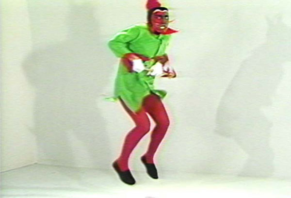 Bruce Nauman - No No New Museum (1987)
This was another piece which was introduced to us during our first lecture for the Being Human project. No, No, New Museum is a looped video recording of a jester performing a temper tantrum. When I first watched the video, I found it very humorous and comical - the jester kept jumping up and down, continuously yelling “no, no, no, no, no…!” throughout the whole video. What made the video even more intense what the expression that the jester made whilst jumping. His face conveyed so much frustration and anger which made the video itself so abrasive and disturbing. I think the contrast between the jester's anger and the reaction that was expressed from the audience further conveyed the difference between how human reaction in certain situations. It makes me question about the different emotions that we express as humans and how we present these types of emotions or behaviour towards a designated audience. In Nauman's works, I am interested in the way he questions aesthetic values and established norms of good and bad. It inspires me to explore the positive as well as negative aspects of human characteristics.
Bruce Nauman - No No New Museum (1987) - Still Images
EXO - OBSESSION (ALBUM COVER)
Exo - 'Obsession' - Album Cover
Recently, a new album has been released by EXO, a Korean boy group band. I was very surprised by their new style and their cover album. I really liked the composition and layout of the album cover - it looked very scientific and professional which inspired me to create medical reports referring to album cover. Of course, I will not create my reports using the information as shown from the cover, however, I think that this was a good starting point in creating my medical reports. I knew that I couldn't just put images on the medical reports without any context, therefore I will be creating my own photos that resembled the imagery of bacteria and viruses.
LUKE JERRAM - GLASS MICROBIOLOGY
Luke Jerram - 'Deadly Beauty Now', Glass Microbiology
https://beautifulnow.is/discover/wellness/viruses-are-surprisingly-beautiful-see-luke-jerram-glass-incredible-sculptures-to-see-beauty-in-danger
Bacteria and microorganisms can be seen as beautiful if we look at a different angle. Luke Jerram, a British installation artist uses both art and science to explore the edges of perception. He created a series of large sized glass sculptures in the shape of pathogens. (microscopic images) The artist was fascinated with the beauty of shapes and textures of viruses and bacteria, hence he titled his work 'Glass Microbiology'. He decided to leave the sculptures transparent (no colour) in order to create "jewel-like beautiful sculptures which holds a complex tension between the artworks' beauty and what they represent". The glass sculptures looked gorgeous and beautiful, it reminded me of how big our universe is and the way we see pathogens with only our microscopes. This seems like an impossible thing to do, but Jerram has clearly broke the boundaries by creating pathogen glass sculptures to gain the viewers attention of how beautiful bacterium can be.
LISA NILSSON
Lisa Nilsson - Tissue Series: Anatomical Cross-Sections in Paper
The pieces that comprise Lisa Nilsson’s “Tissue Series” are made of Japanese mulberry paper and the gilded edges of old books. They are constructed by a technique of rolling and shaping narrow strips of paper called quilling or paper filigree. Quilling was said to have been first practiced by Renaissance nuns and monks who made artistic use of the gilded edges of worn out bibles, and later by 18th century ladies who made artistic use of lots of free time. Lisa finds quilling exquisitely satisfying for rendering the densely squished and lovely internal landscape of the human body in cross-section.
SUSAN ALDWORTH - HUMAN CONSCIOUSNESS
Susan Aldworth - 'Brainscape 24' - Etching and Aquatint
'RE-EDIT' - CHRISTIAN MARCLAY - TELEPHONES, 1995
'RE-EDIT' - CHRISTIAN MARCLAY - TELEPHONES, 1995
Christian uses a combination of black and white as well as colour film clips featured from Hollywood films and edited them into a 7-minute video which highlighted different people utilising an array of telephones, all designed before the smartphone era. I like how the artist had shown different types of emotions and reactions expressed by humans when they pick up the phone. This consisted of anxiety, anger, boredom and even curiosity. I was especially immersed in the bit when phrases was spoken by the telephone users. When the clips were played together, it sounded like a long cohesive conversation. It was somewhat humorous and strange at the same time, normally we do not think about the way we speak to others on the phone. I think it is more of a natural process where we pick up the phone and greet the other user on the other side. However, when I watched the people answering the calls, it made me realise how we react in different ways.
'RE-EDIT' - NAM JUN PAIK - VIDEO FLAG,1985 - 1996
'RE-EDIT' - NAM JUN PAIK - VIDEO FLAG
I really love Nam Jun Paik's video works and installations. One of his works that I was especially drawn to was the 'Video Flag'. The installation was created in a way that the images are moving rapidly and when multiple screens are combined and stacked together, it forms the pattern of stars and stripes of the American flag. I was very amazed by the flickering of the images as well as the bright colours that was displayed from the screens. Through his work, he aims to emphasise the pop cultural influences of America as shown from the stars and stripes on the flag.
'DATAFIED' - STORE X VYNL FACTORY (EXHIBITION VISIT)
The Store X Vinyl Factory - 'Vanishing Point', UVA
The exhibition involves a multi-sensory exploration of light and sound. It features three large-scale installations by UVA. When I looked at the images of the work, it immediately reminded me of what big data looks like - in my mind, I had thought of very futuristic and technological images likes numbers and wires. This was exactly what I had in my mind. One particular installation that caught my attention was called "Vanishing Point". I really liked the simplicity of the installation and how the light directly shines through space, creating a calm and peaceful mood. It uses an immersive laser installation that uses perspective as a way to reshape and redefine a space. Compared to other installations, this particular one made me feel at ease when looking at it, whereas when I watched other documentaries of the other installations in the exhibition, I felt that those were a bit too noisy for my liking, although I still really liked them.
'DATAFIED' - BLACKZILLA
'DATAFIED' - DIGGING FOR BLACK TRANS LOVE
'DATAFIED' - DANIELLE BRATHWAITE SHIRLEY
I came across Danielle Brathwaite Shirley's works. Danielle is a Black Trans artist who focuses on film and sound; he explores QTIBPOC experience whilst incorporating technology into his outcomes. I think that the artist's works are visually amazing, I really liked his use of composition in his films - everything is digitally created as if another world is created which portrays the world of Black Trans. I also find his use of bright colours fascinating, it really grabs the viewers attention, along with the audio which sounds both overwhelming and fulfilling at the same time. The first time I watched his films, it made me feel very anxious but excited at the same time. I was able to feel the 'community' and bonding that was shown in his works in regards to bring the Black Trans 'family' together. I decided to incorporate elements of his work into my own - focusing predominantly on video-editing techniques, audio tuning as well as making the film look visually appealing and aesthetic, as well as adding an element of horror and anxiety in it.
'DATAFIED' - NORA LIGORANO - IAMI
Nora Ligorano, MarschallReese, 2013 - IAMI
https://vimeo.com/100585170
IAMI is an interactive piece which uses personal data generated from FitBit to portray changing emotions of an individual. The data collected from Fitbit is generated using a self-reporting emotional survey. Each emotion is portrayed with a different colour based on the data and is separated into three different modes/cycles. Its speciality is to change from an overall colour portrait to a portrait of the artist according to a real-time display of the subject's activity. What I found interesting about this piece is the neon colours that are expressed in the portraits. As the light moves, it creates a very calming pattern which allows me to feel immersed in the portrait. This project reminded me about the relationship between human's emotions and digital technology in modern society. The colours of the data further creates different perceptions and interpretations for audiences which I thought was very powerful. It also made me think about how important technology is in today's life where we use it to represent our identities. I am intrigued by the fact that we can now use technology to record our activities as well as our emotions and feelings. Even the simplest details such as the day of the week, the number of steps an individual has taken or even the psychological state of our minds can now be shown through technology. This makes me question whether technology knows more about us than we do of ourselves.
'DATAFIED' - RYOJI IKEDA - DATAMATICS
Ryoji Ikeda, Datametrics, 2006-2008
https://vimeo.com/62242278
Datamatics is an art project created with large amounts of code generated from software and hard drive errors. The data collected was sequenced into both 2D and 3D patterns and a soundtrack was constructed to reflect the chaos of the imagery. Inspired by the primary principles of datamatics, the artist deconstructs hard drive errors and turned them into sound, visuals and source codes. I was intrigued by the visual and audio overestimation in this project, especially with its extremely fast frame rates and variable bit depths. In addition, the scale of this project was so huge, which allows the audiences to be immersed into the installation. It feels overwhelming but also makes me watch in awe at the same time. I was inspired by the visual imagery created in the art which also reminded me of bar codes that can be seen behind packages. I think the artist has successfully portrayed the idea of digital technology and data. While watching the video of people walking over the moving patterns, it seems like the data is overpowering the audiences which makes them feel smaller, and less important. This may hint the idea of technology taking over mankind, due to its endless uses. Ikeda's works had inspired me to create something which feels both overpowering and intense at the same time. Overall, I thought the visuals were very powerful and hypnotic.
'DATAFIED' - RYOJI IKEDA - DATAMETRICS
'DATAFIED' - CAMERON ASKIN
Cameron Askin - Cameron's World
Lately I have been very interested in post-internet art. I came across Cameron Askin's works which I fell in love with immediately. His works are predominantly pieces of dense net art that curates of old Yahoo Geocities webpages into a giant clickable collage. I love the stunning graphics that pop up everywhere in the website. When I clicked on one of the planet icons, it bring me into another website like its tripping through old internet pages. The idea of exploring net art in her works allows viewers and users to gain a better understanding of both political and social conditions through human interactions. His works made me realise that there is also a beautiful and aesthetically pleasing side of internet. The individual tabs also caught my attention as they looked very much like it came from a game.
Screenshot of Cameron Askin's website
I was even more amazed by the cover page of Cameron Askin's website, it almost looked very welcoming, but also looked like there was two different worlds. It wasn't a 'typical' internet world where we can easily access information using a search engine. It was more like an 'invitation' for the user to lure them in the 'new world'.
Screenshot of Cameron Askin's website
'DATAFIED' - LEETSPEAK LANGUAGE
Leet speak chart
I was very interested in the 'language' that is commonly used in terms of media and technology. This can sometimes be seen in coding or big data information in general. The name of internet language is called 'leetspeak'. The full definition of this is "an informal language or code used on the Internet, in which standard letters are often replaced by numerals or special characters that resemble the letters in appearance." I thought this was a very creative idea since we can incorporate both letters, numbers as well as symbols to form a new language. Overall it is a very simple language which could be learned quickly, however, since it is ever-changing, this shows how developed technology is in today's society and how humans strive to improve technology and media everyday.
Leetspeak Language
'LUX' - AGNIESZKA SZOSTEK - WATER MEMORY
Agnieszka Szostek - Water Memory, 2019
Agnieszka's works predominantly focuses on the use of plastic materials to recreate the texture of human skin. I found it interesting as to why the artist had decided to use plastic as one of her materials to explore the beauty of nature. Suppose she wanted to show the contrast between nature and the things that are affecting it which then causes destruction. I was intrigued by the performance that the artist did in the video piece, it feels like she was trying to connect with the nature surroundings. The mention of 'memory' in the title further suggests a sense of blurriness. Since water is constantly moving during liquid form, it seems interesting to explore how memory is displayed through the form of water. From this piece, I felt like it seemed like a different world where the artist had her own freedom of expressing her emotions in nature.
'LUX' - MARIO SANTAMARIA - TRAVEL TO MY WEBSITE
Mario Santamaria - Travel to My Website, 2016
When I read about Mario Santamaria's works, it feels like there is a twist to his works which conveyed the idea of the real world and the imaginative The artist created a website that presents the data of his journey of reaching to his server. It was interesting how Santamaria was able to convey his journey into data and statistical information. This reminded me about my idea of converting images from my dreams into real life images represented in the form of a video.
Mario Santamaria - Travel to My Website, 2016
'LUX' - LORNA MILLS - ROADKILL
Lorna Mills - Roadkill, 2019
https://aos.arebyte.com/contents/lorna-mills/
"What strikes on first viewing of a loop by Lorna Mills is the apparent of ugliness of it all: ugliness in terms of subject or content and ugliness in terms of pictorial structure. Beauty, traditionally, prolongs its perception by swinging the eye on a grand tour of sorts; and ugly is that which distracts and confuses and makes the eye smart from its overexertion. The division once was common in handbooks for painters. Today it persists in arts education under loose talk of ‘balance’ and the shopworn ‘rule of thirds.’ Such are the claims to which Mills is the rejoinder: for hers is a kind of dynamics without beauty." - Millennium Film Journal
According to the text as shown above, the intention of this piece was to emphasise the 'ugliness' of the subject, content and pictorial structure. At some point I do agree with this statement because of the vast difference between the river and the green spaces. It was further mentioned that because of the ugliness of the river, this diverts the audience to look at the nature and the image as a whole. In fact, when I looked at the water and land together, it doesn't seem ugly to me at all. I seem to understand what is happening in the image, which may seem confusing to other viewers. I think that the idea of distracting the viewers attention is to create contrast between the ugliness and beauty of nature, hence finding its balance in between. I love this piece not only because the visual imagery of the photograph, but also the mood that it has made me feel while looking at it. Instead of making me feel disturbed or distracted, I think this piece made me feel calm and relaxed. I liked the combination of digital technology and nature being incorporated together. It makes it seem like there are two different worlds in one. I am very interested in the idea of creating two worlds in my LUX piece - predominantly looking at imaginative and real world.
'LUX' - LUKE FOWLER - CÉZANNE
'LUX' - LUKE FOWLER - CÉZANNE
Luke Fowler - 'Cèzanne' (Still Image)
Luke Fowler's 'Cèzanne' is probably my most favourite video piece out of all the other ones. I was drawn by the overlapping layers of the film footages and the calming sound effects of birds chirping from the background. It made me reminisce my childhood where I used to play in parks with my cousins. I also love the way the artist had used a grain effect on the footages which made it looked like old film that were taken from long ago. It was clear that Fowler was trying to create an impressionistic approach to portray light and nature, especially hinting the idea of time in his works. He used different techniques such as time-lapsing to show the changes in the environment. I was very inspired by the artist's editing techniques and am very looking forward to using these techniques with my own video.
'LUX' - IBLARD JIKAN
'LUX' - IBLARD JIKAN
Iblard Jikan, Naohisa Inoue - GIF Moving image
Lately I have been watching Studio Ghibli anime since I was recommended to watch Spirited Away after my interim crit. Spirited Away is one of my most favourite anime not only because of the music, but also because of the animation scenes. The landscapes were all very beautiful, it looked like the girl had stepped into a whole different world. Very much like a fantasy world. I further looked into Studio Ghibli and discovered Iblard Jikan. I instantly fell in love with the visual imagery of this film. I think it is a combination of all the different characters in Studio Ghibli works. I especially love the colour theme in the film which consisted of colour like blue and purple. It very much resembled like a different planet, one that holds the beauty of everything. It looked very dream-like, as if I have stepped into a fantasy world.
Iblard Jikan, Naohisa Inoue - Still Image
'LUX' - UNDERWATER FISH CASTLE
Underwater fish castle
During my interim crit, one of my classmates suggested that my video reminded her of an underwater fish castle. She further sent me this image as shown above. I love the colour of the water, it kind of resembled a fantasy world from Castle in the Sky. There was a scene where the two characters looked down in the waters and there was an actual city built underwater where fish was swimming in between them. Since I had included fish in my video as well, I really wanted to show the graceful movement of the fish swimming underwater and how they displayed the image of a dream.